
A wonderfully local and charming project, I provided logo designs and early branding development for a joint camper van and cabin construction business. The logos needed to correlate to each other, sharing a similar colour scheme. The goal of the logos were to achieve a campy look and represent the outdoorsy nature of the business involved with Wheelhouse Design in Halifax, Nova Scotia.
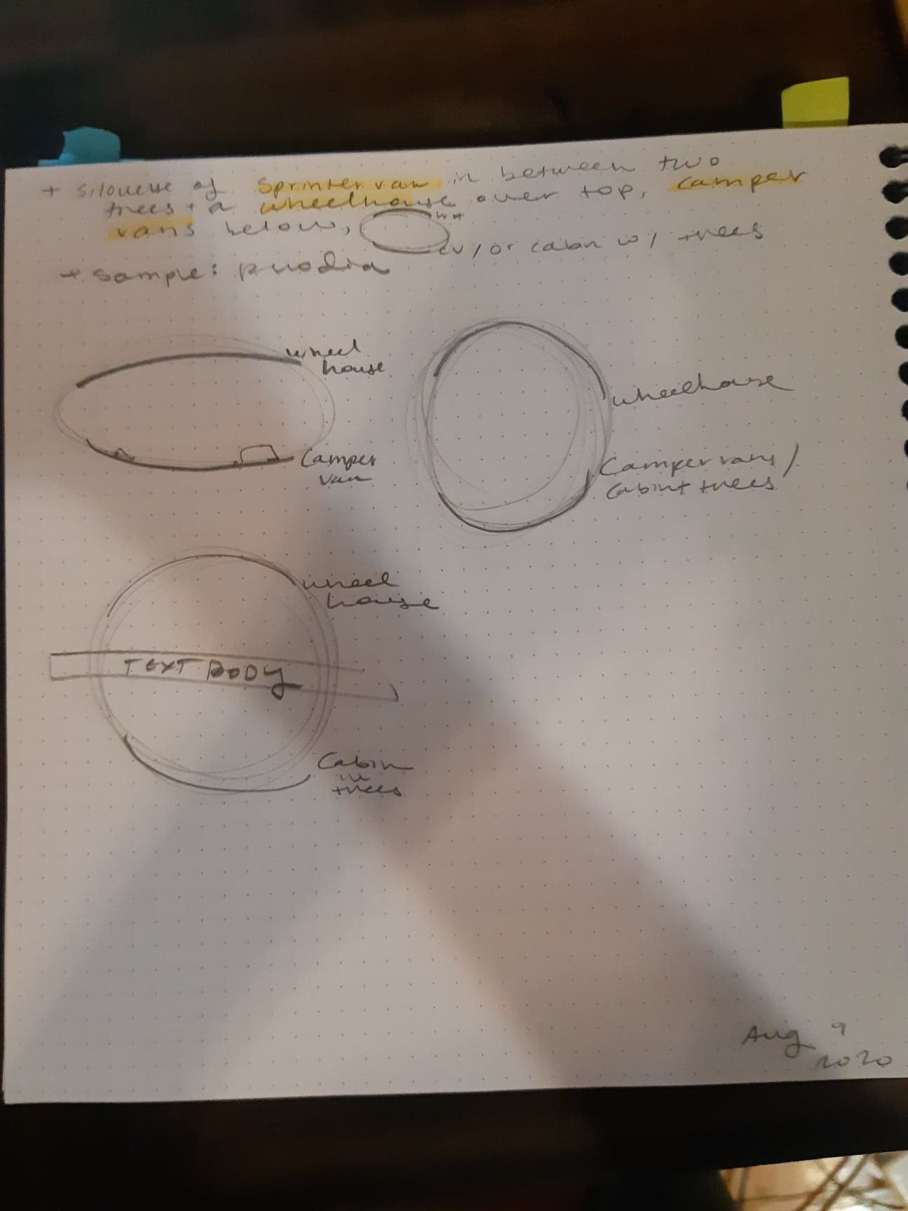
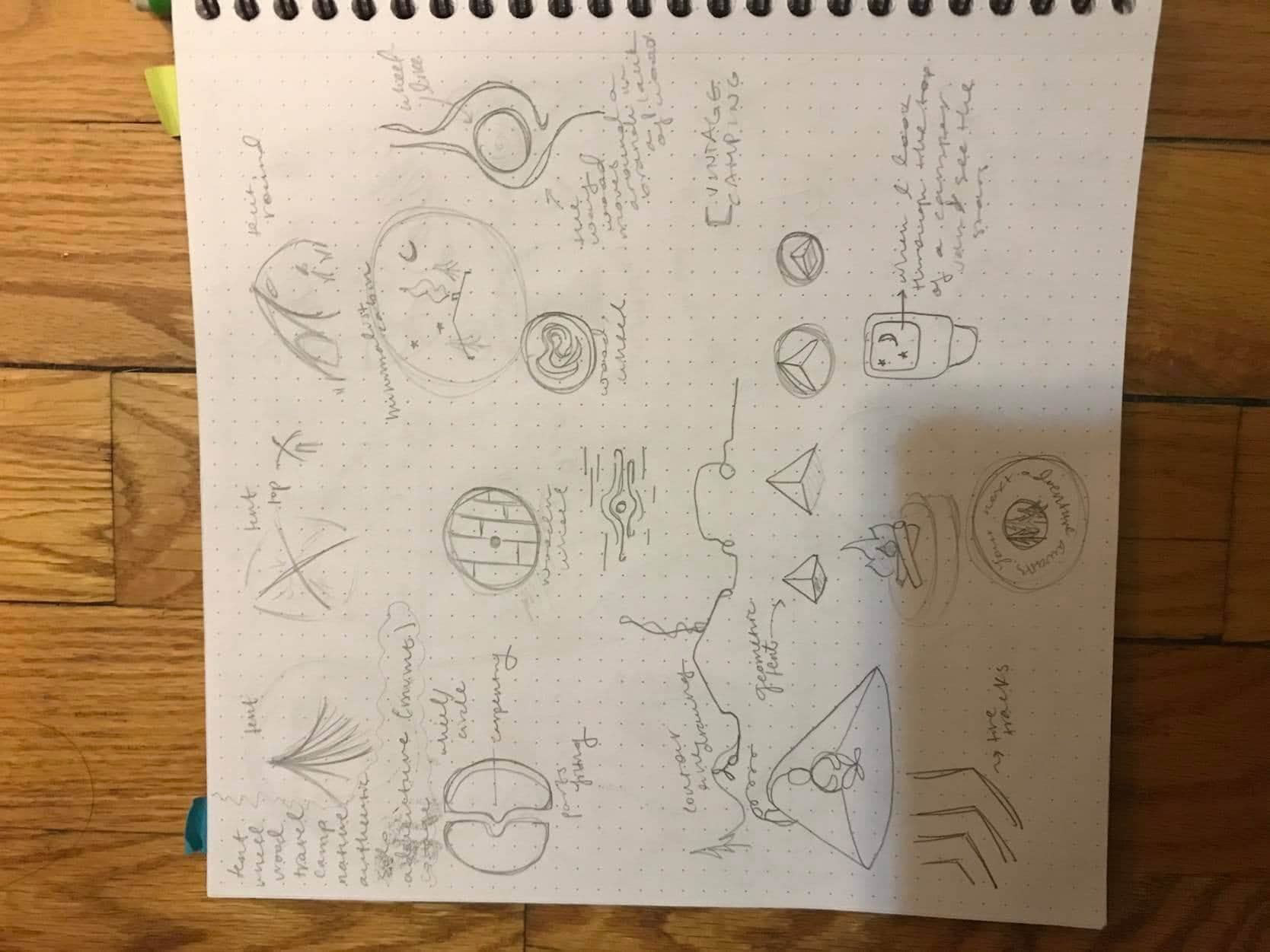
The method involved required more drafting than most projects. This methodology revolved around participation and sharing assets, sketching and drafts created by both the client and myself. Though the methodology was completed (entirely) virtually, it was still very participatory and hands-on between the client's and my own sketches and drafts.
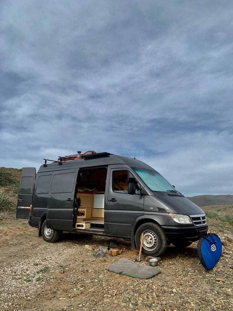
A wheelhouse camper van
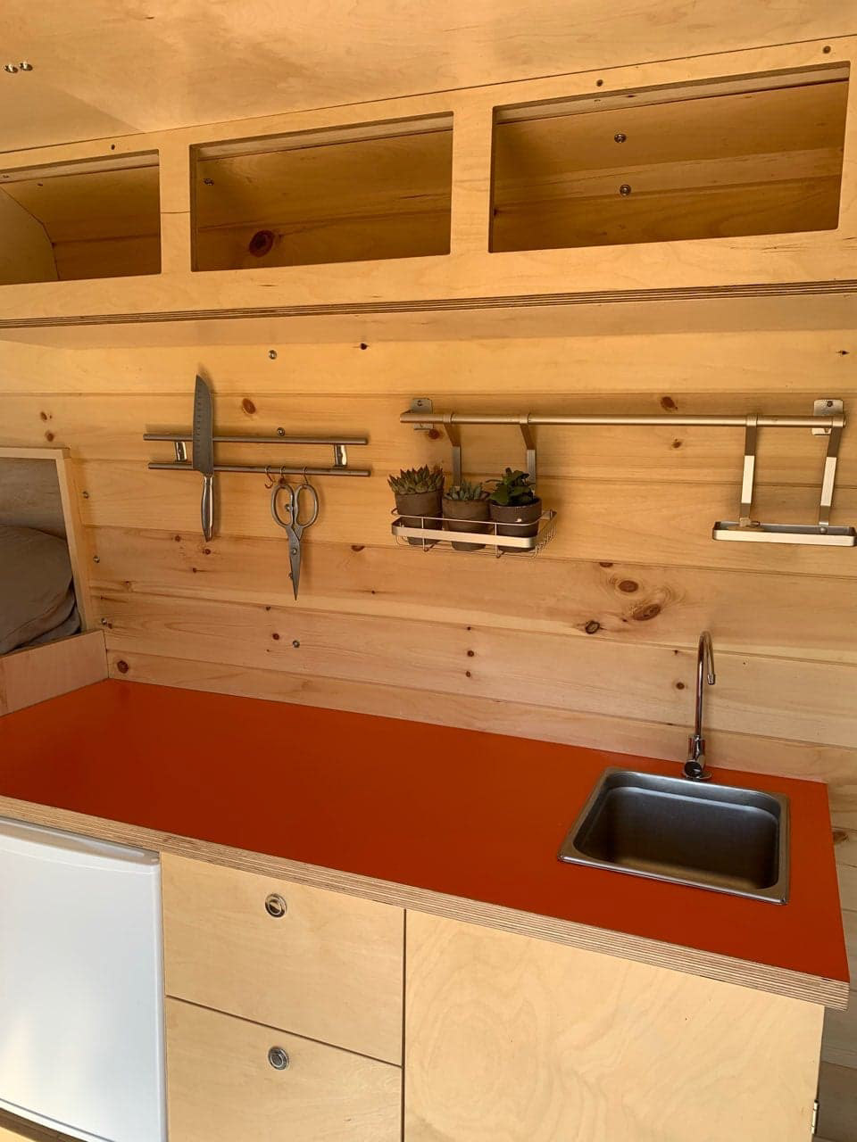
A wheelhouse camper van interior
Logo shapes
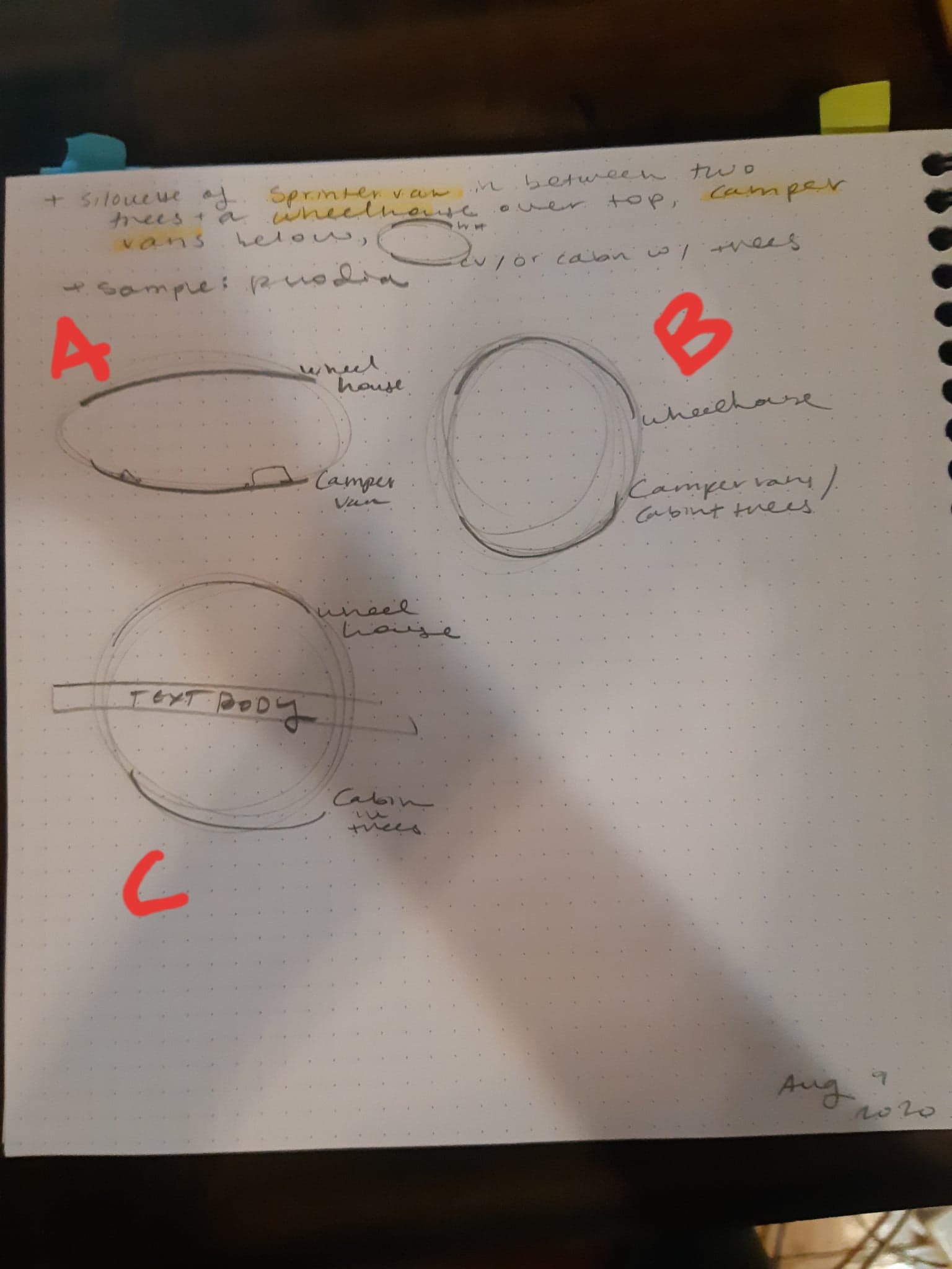
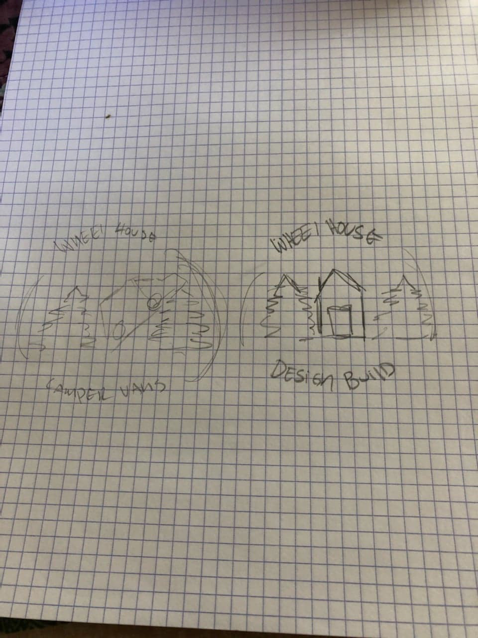
Identified logo shapes from client
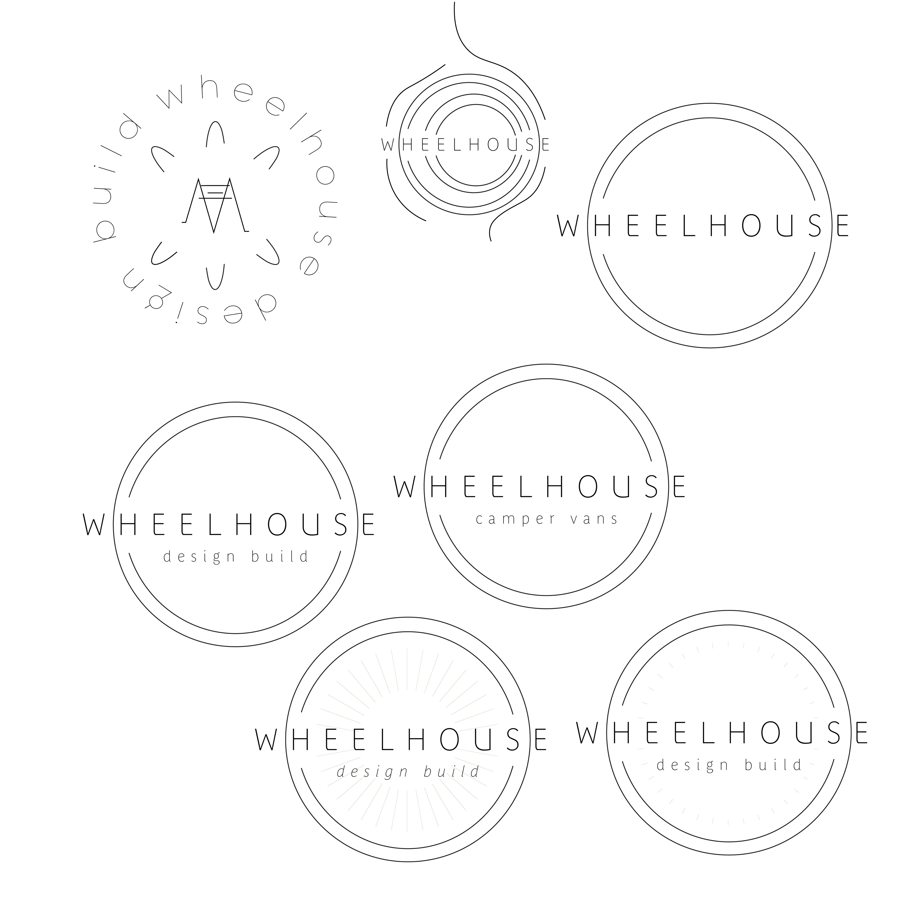
Sketch spread
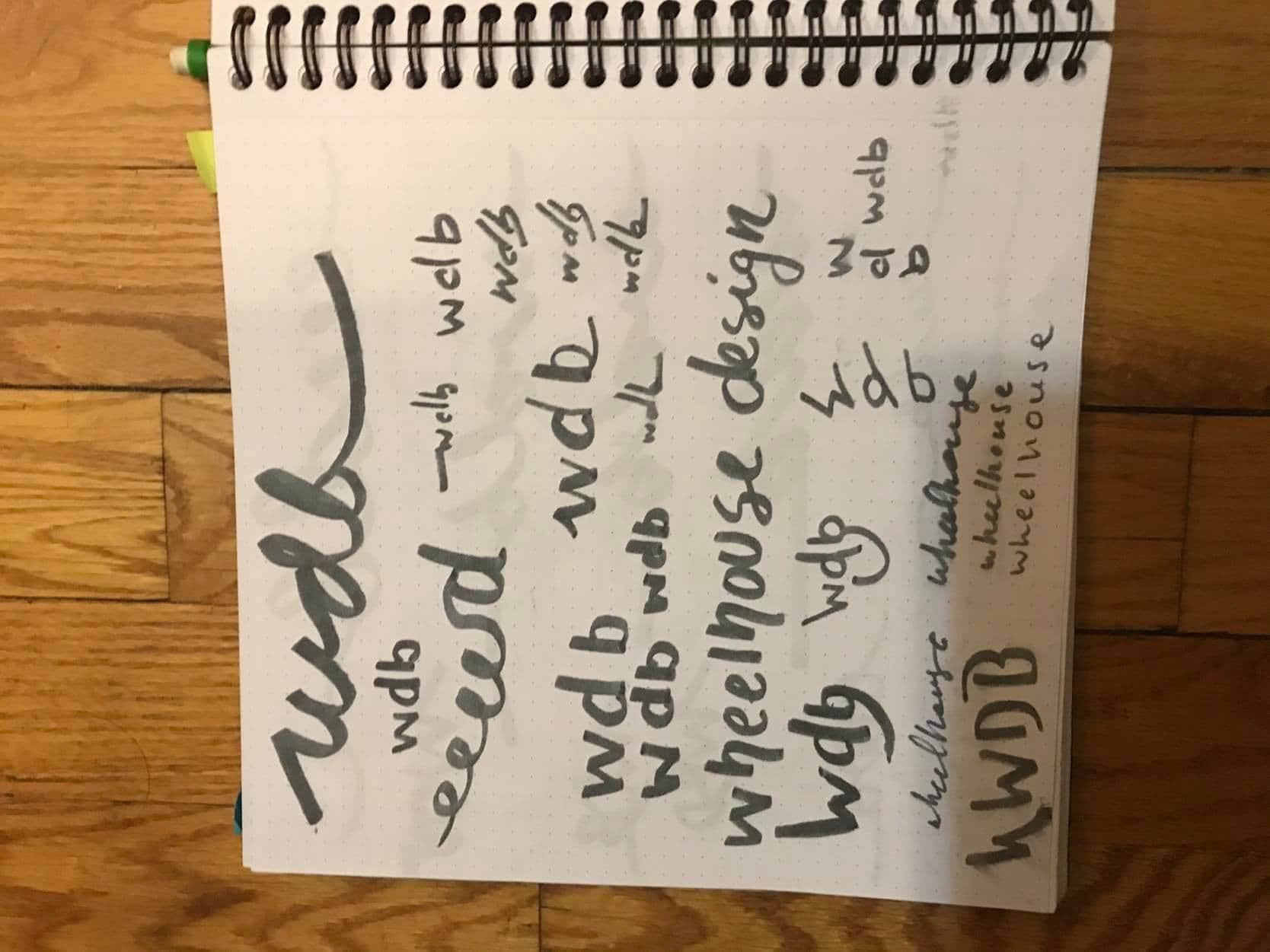
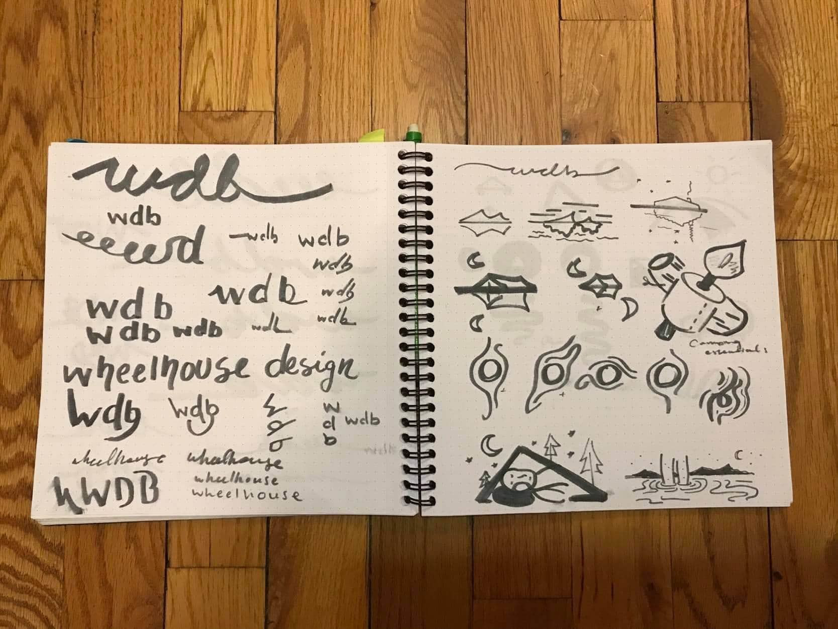
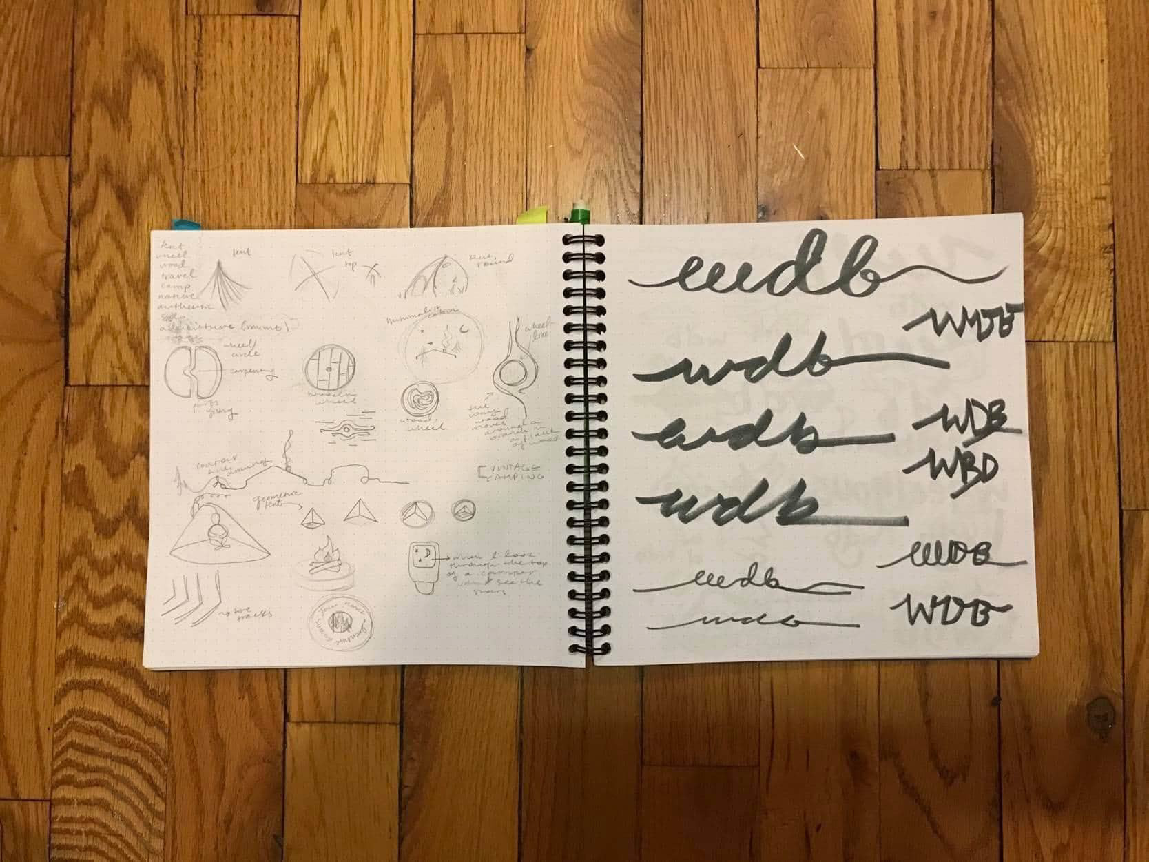
Text sketches
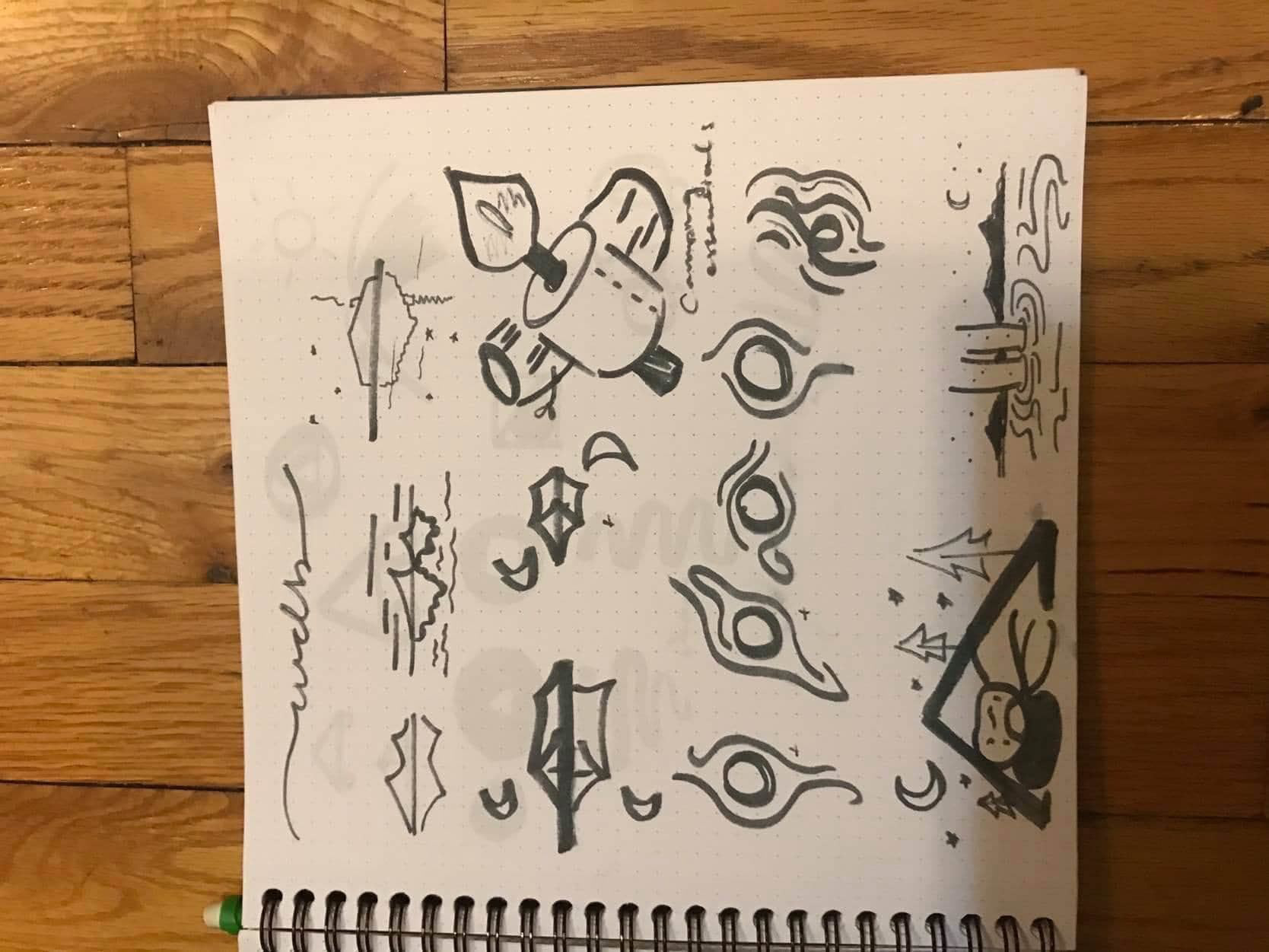
Icon sketches
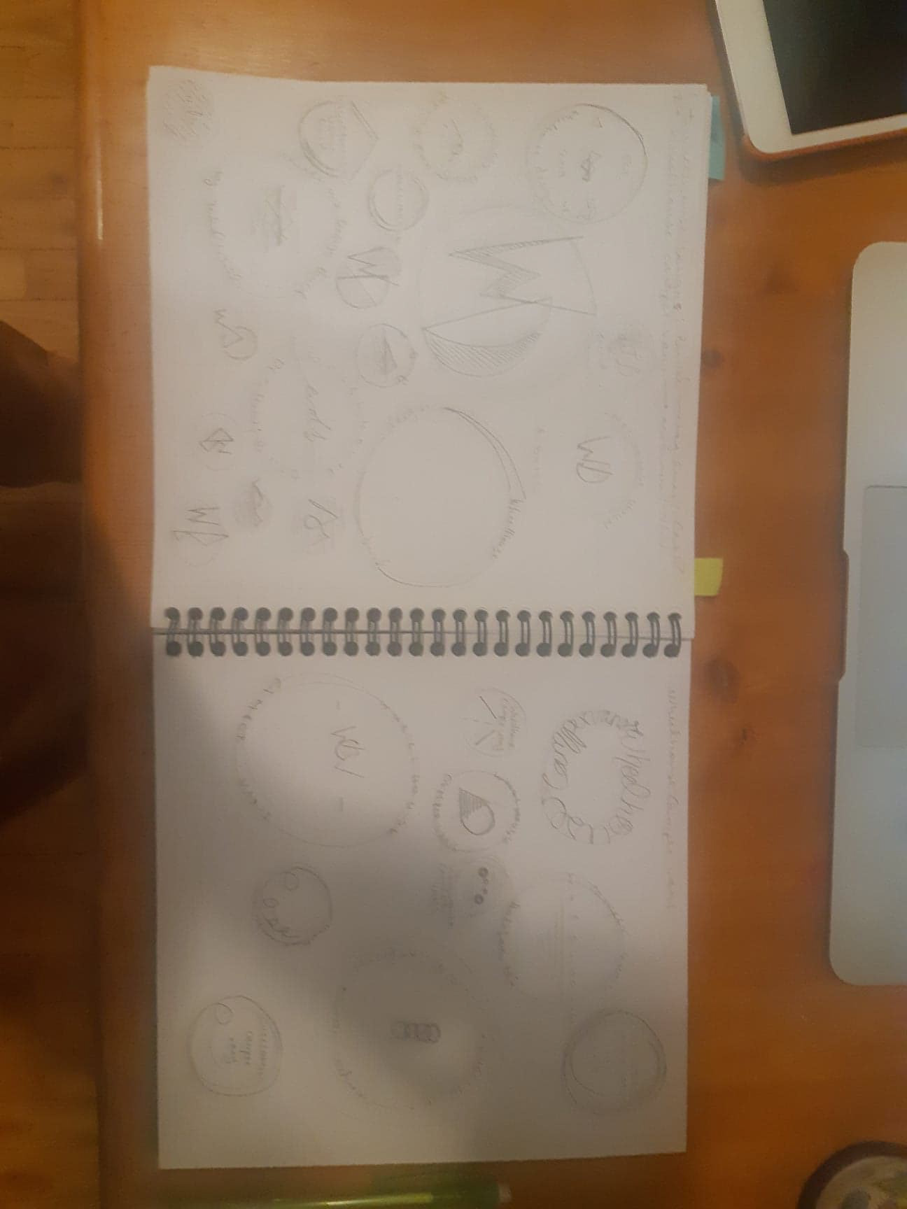
Sketch spread
Sketch spread
Client's logo sketches
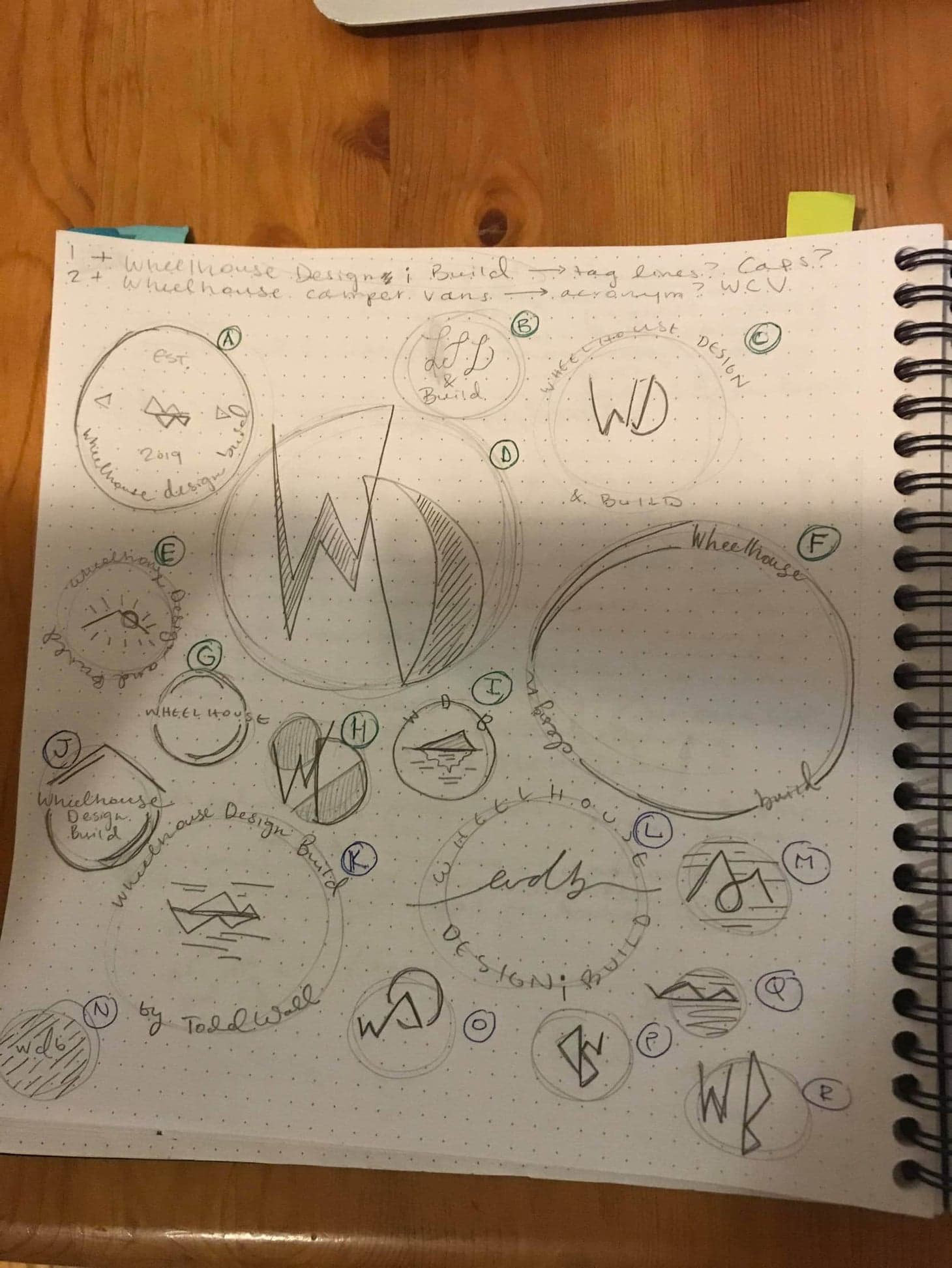
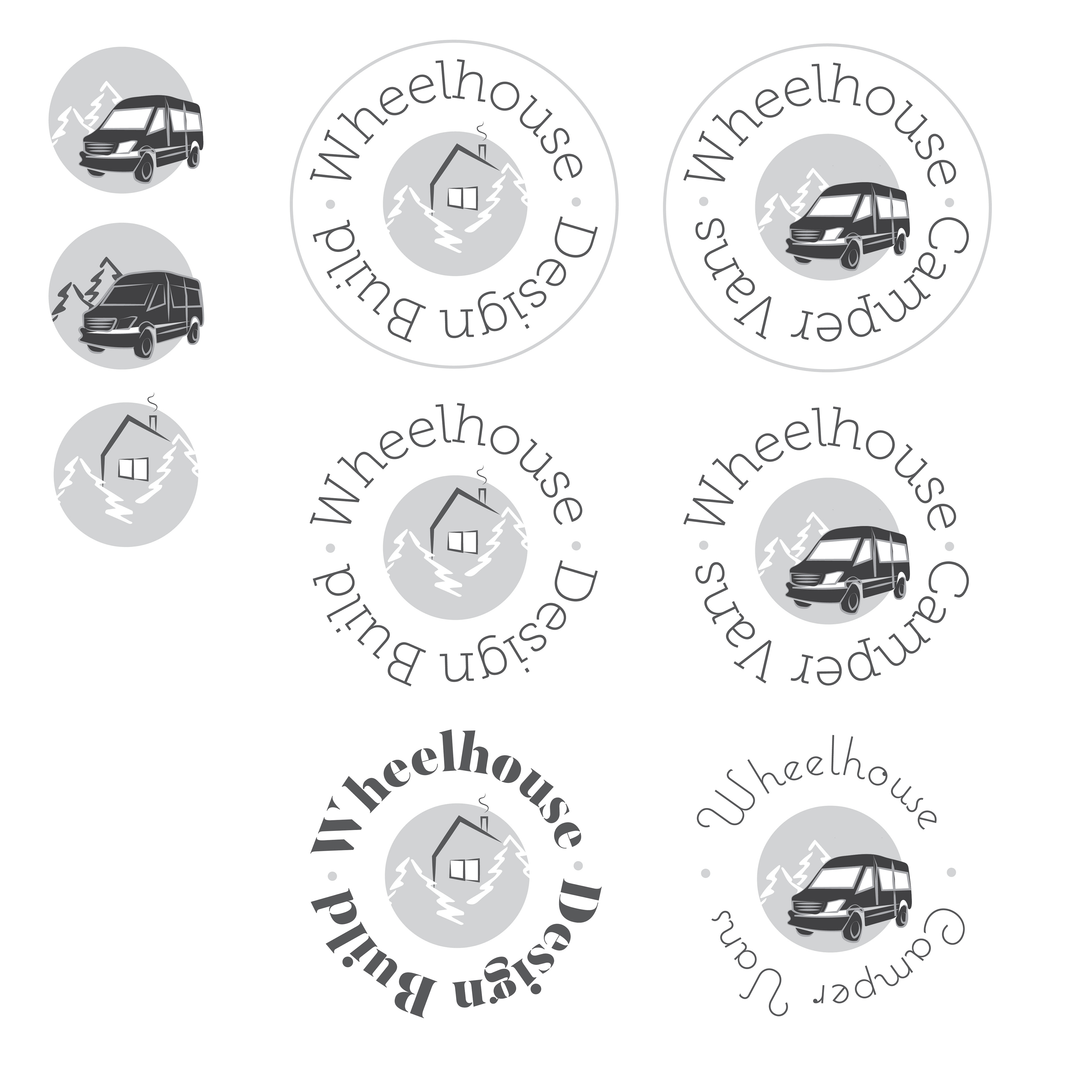
Initial logo sketches
Initial logo sketches continued
This was a super interesting project in that the logos needed to correlate to each other, and have corresponding branding elements. The project required sharing assets between me and the client until we landed on a style that was better suited to the project. These assets reflected the style and nature of the business. After building assets, the client and I exchanged sketches and ideas with each other, and then I developed a few different logo options and redrafted often.
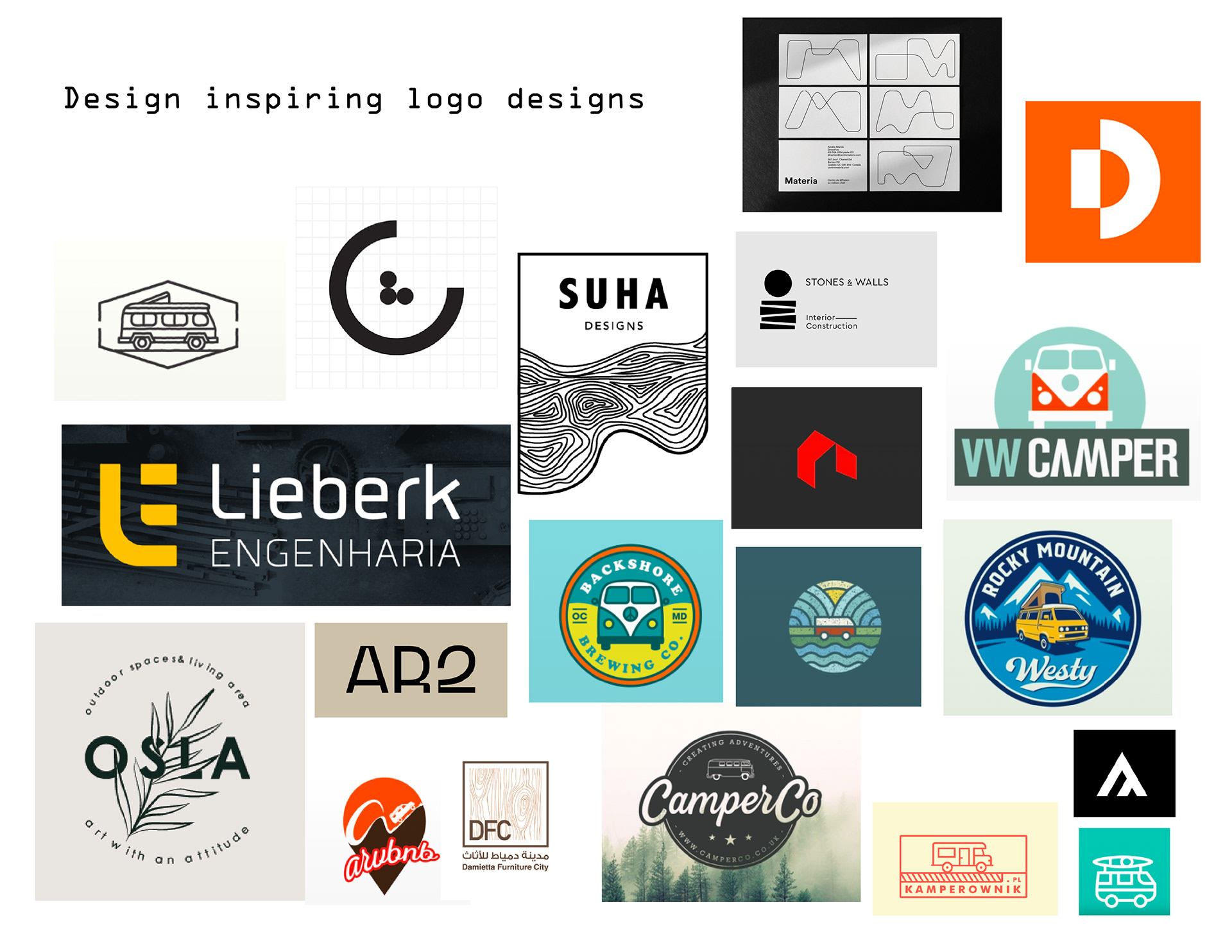
Initial moodboard
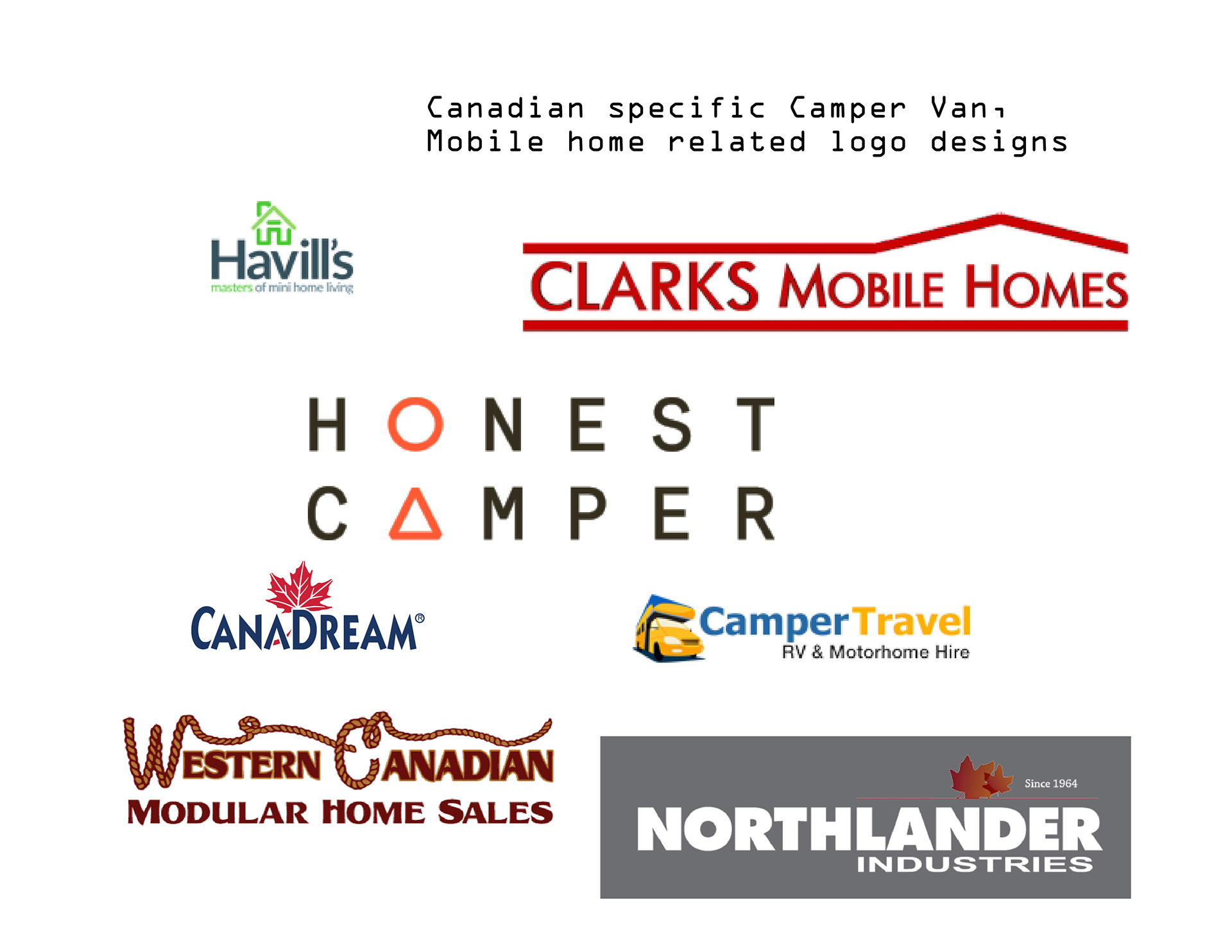
Initial moodboard, Canada designs
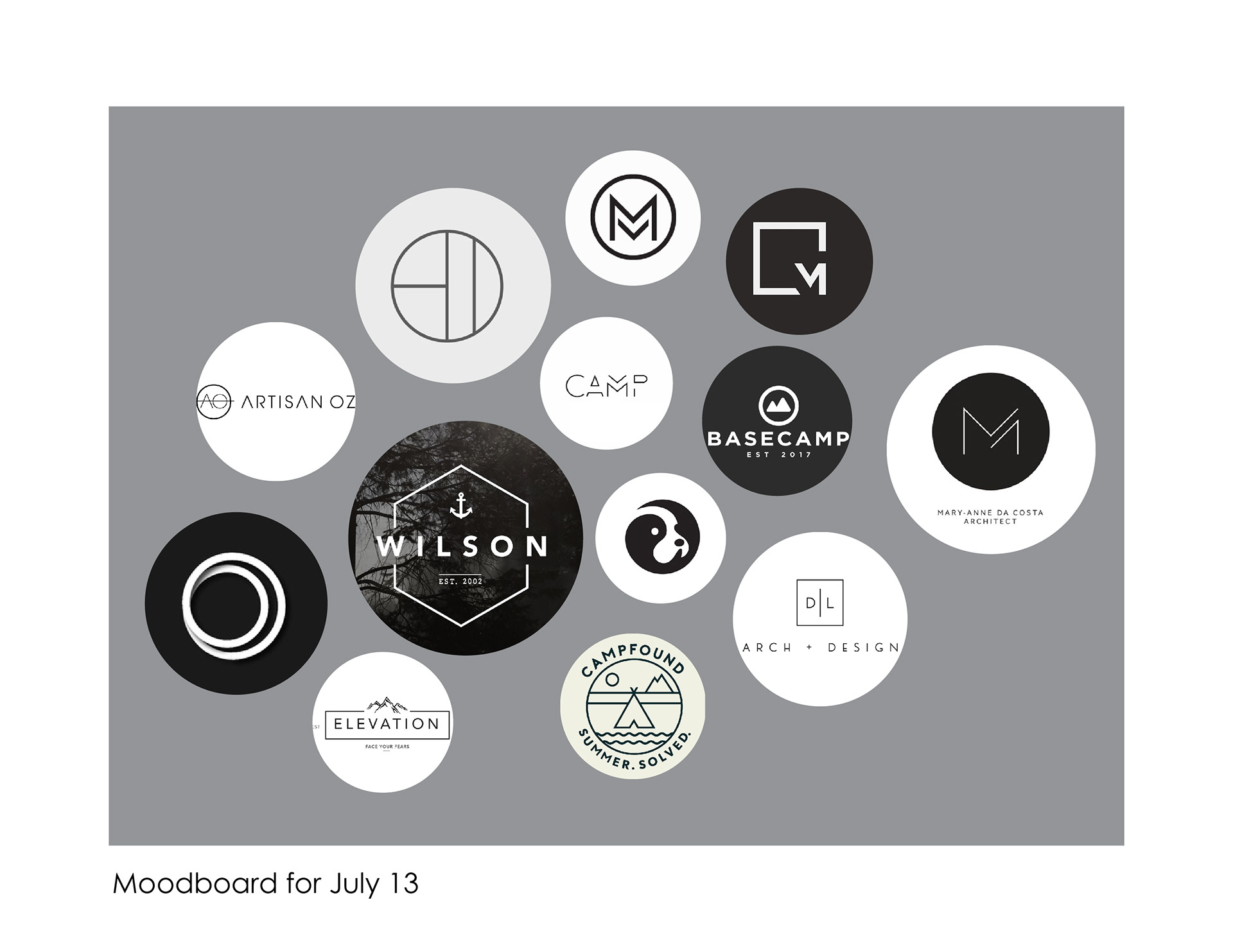
Final moodboard
Sketch ideas
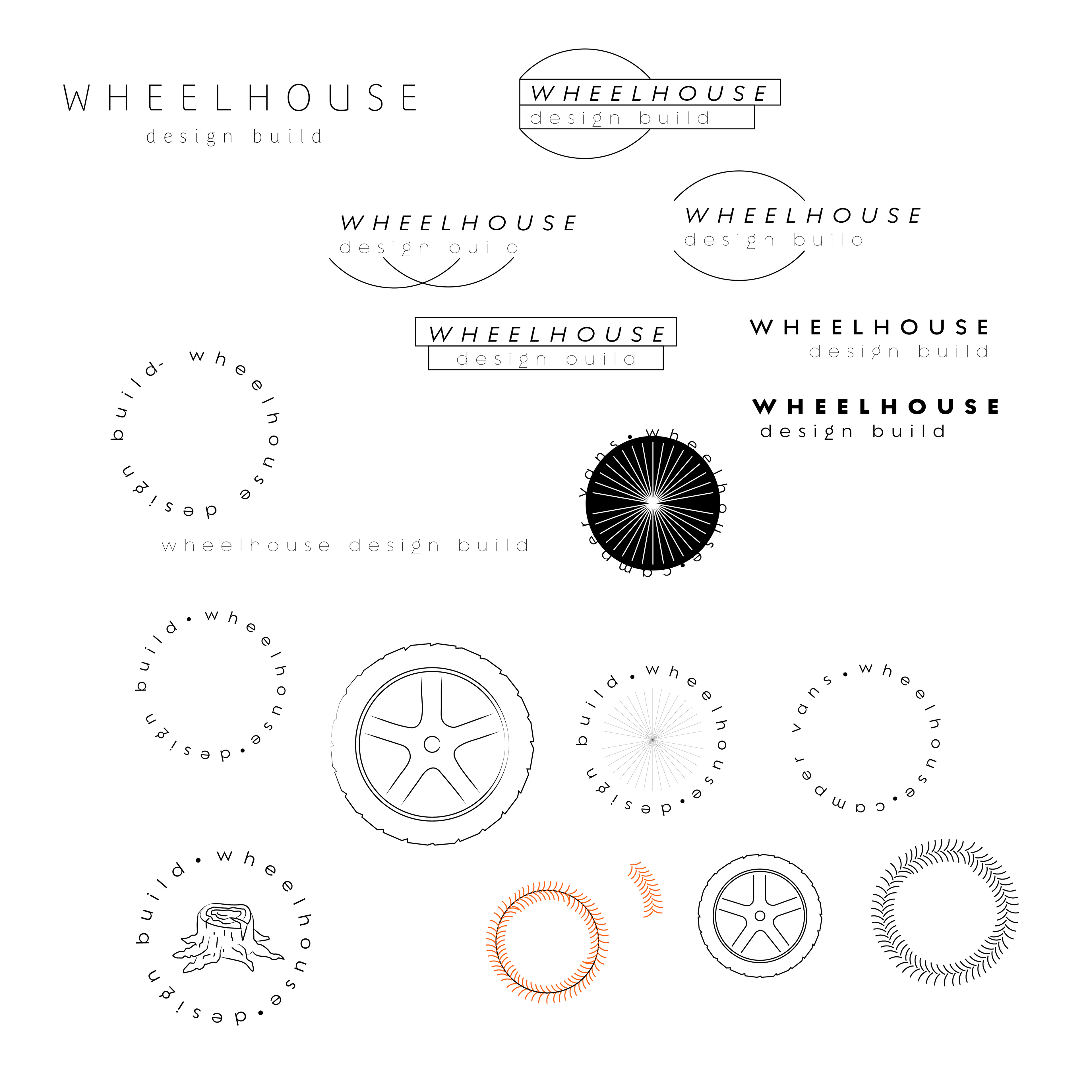
Sketched ideas
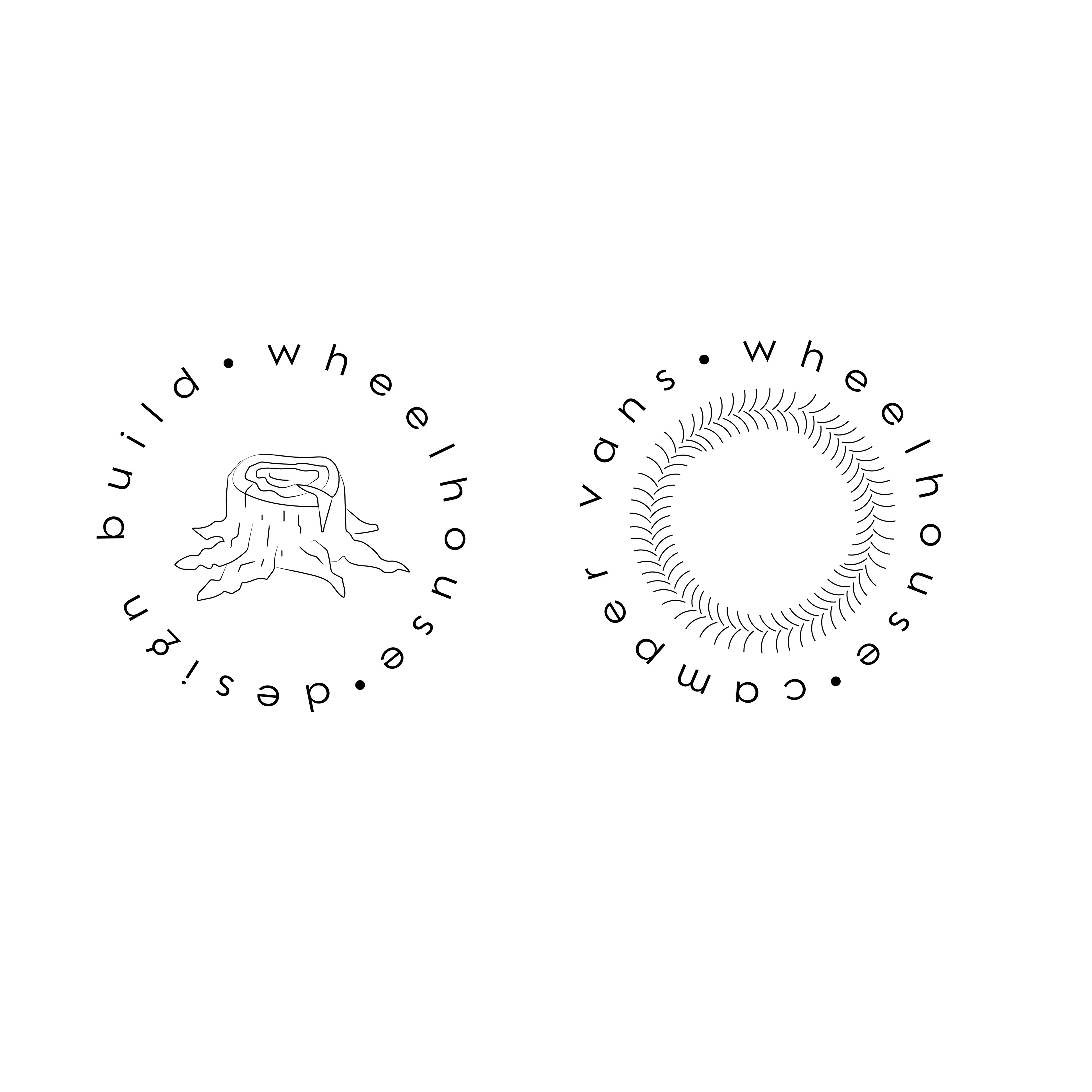
Sketched ideas
The design solution involved building a simple brand outline of what colours were used/to be used for the logos and for future parts of branding in the project, as well as typefaces identified and used for the logo design, and the overall stylistic elements of the logo design to be included in other graphic work.
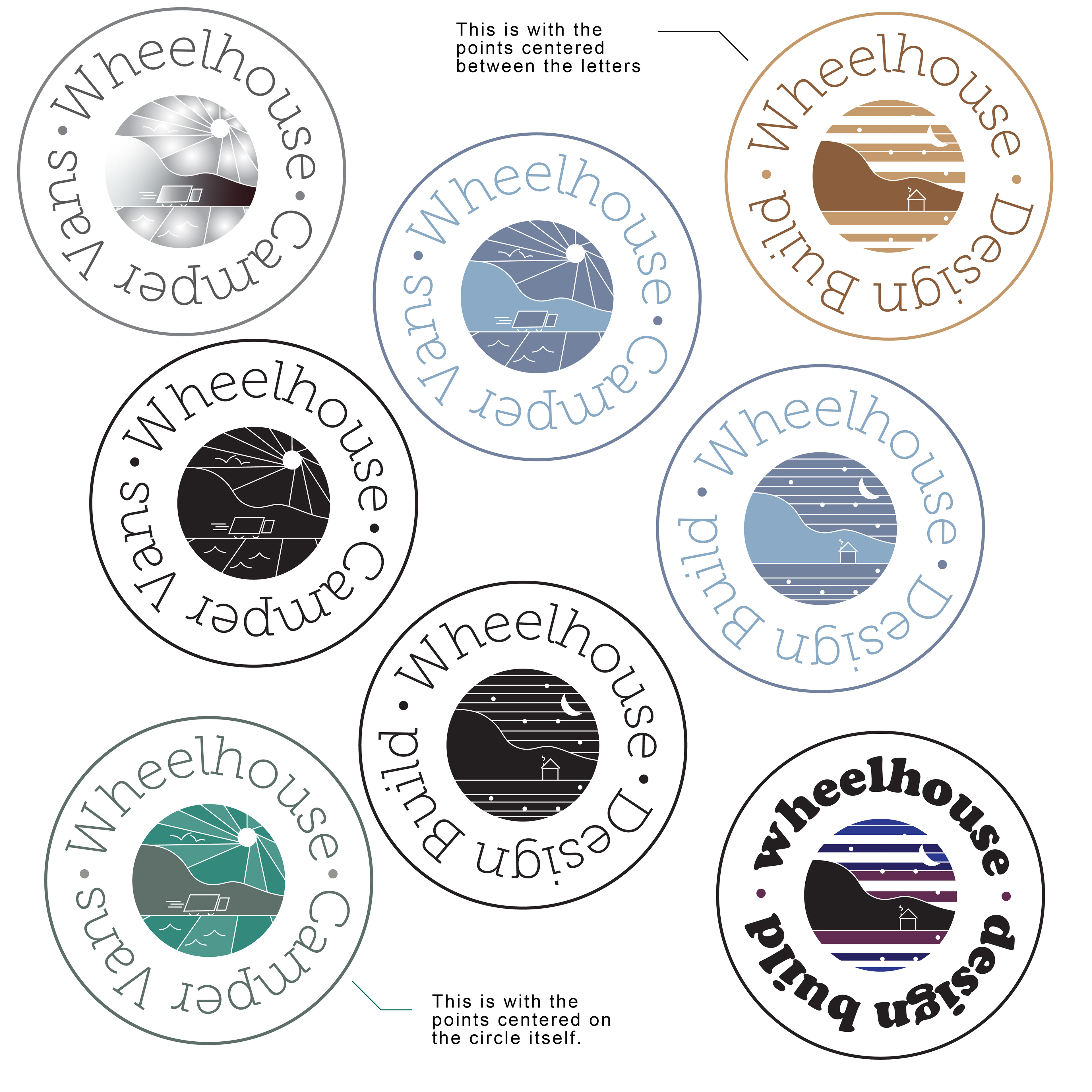
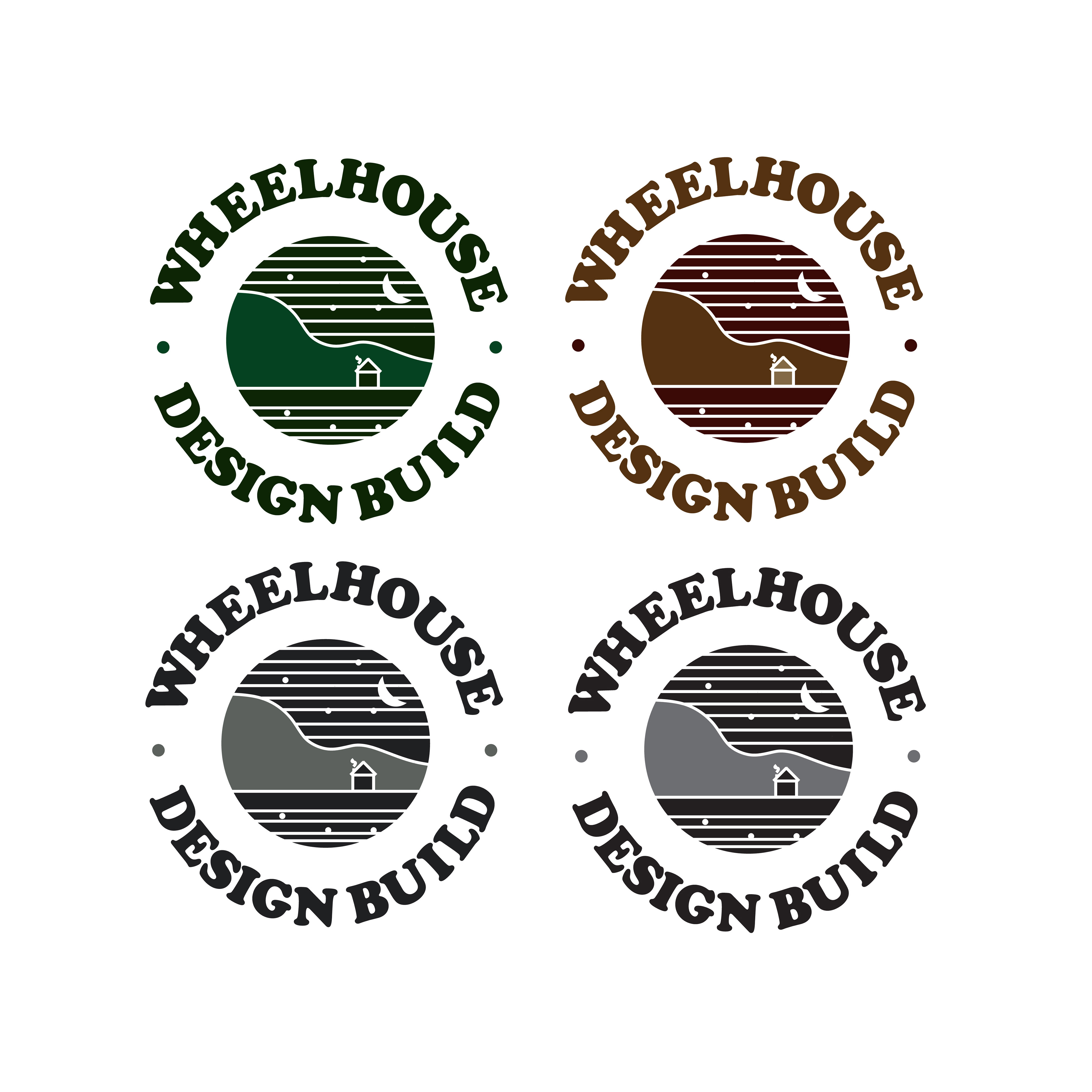
Logo options
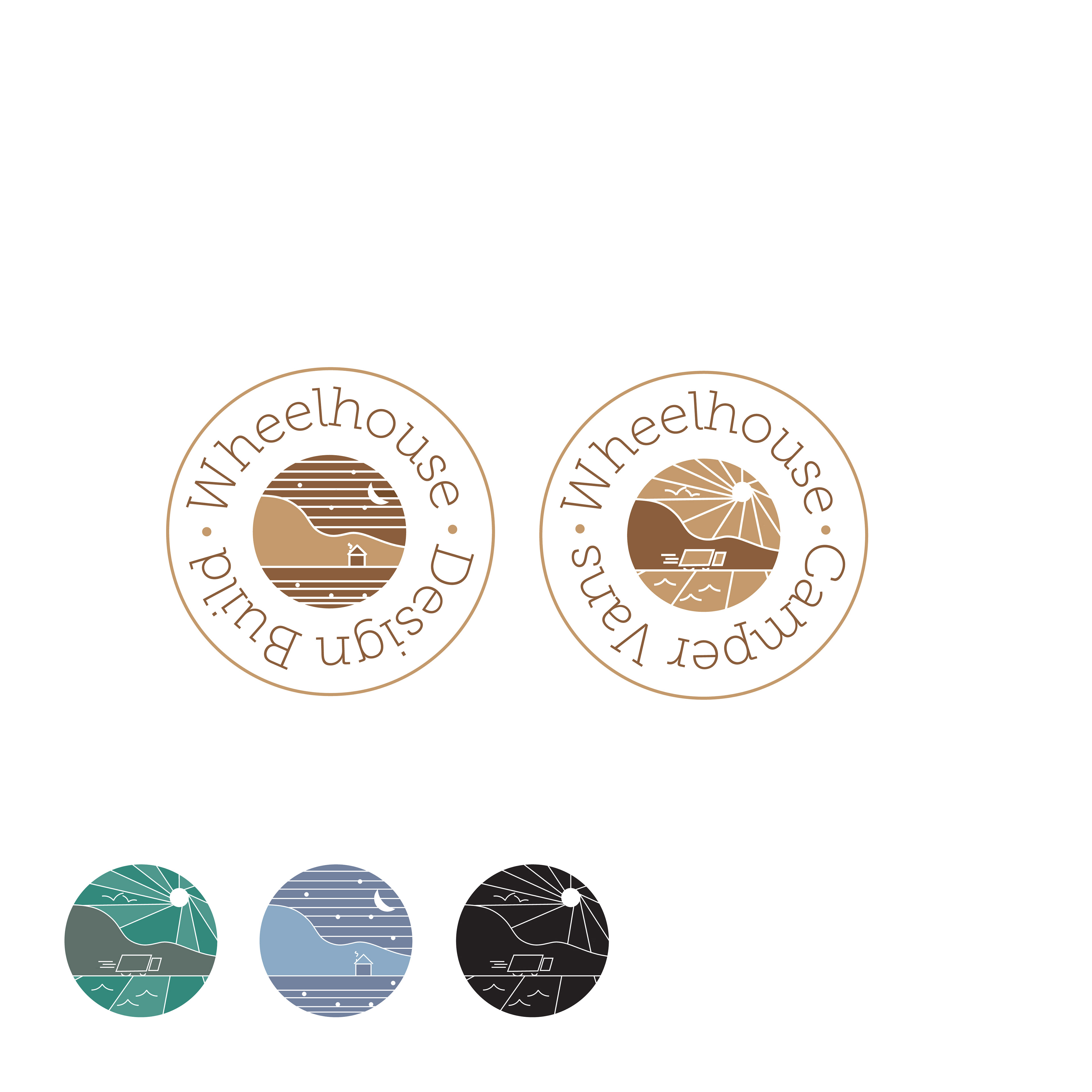
Logo colour options
Secondary logo option
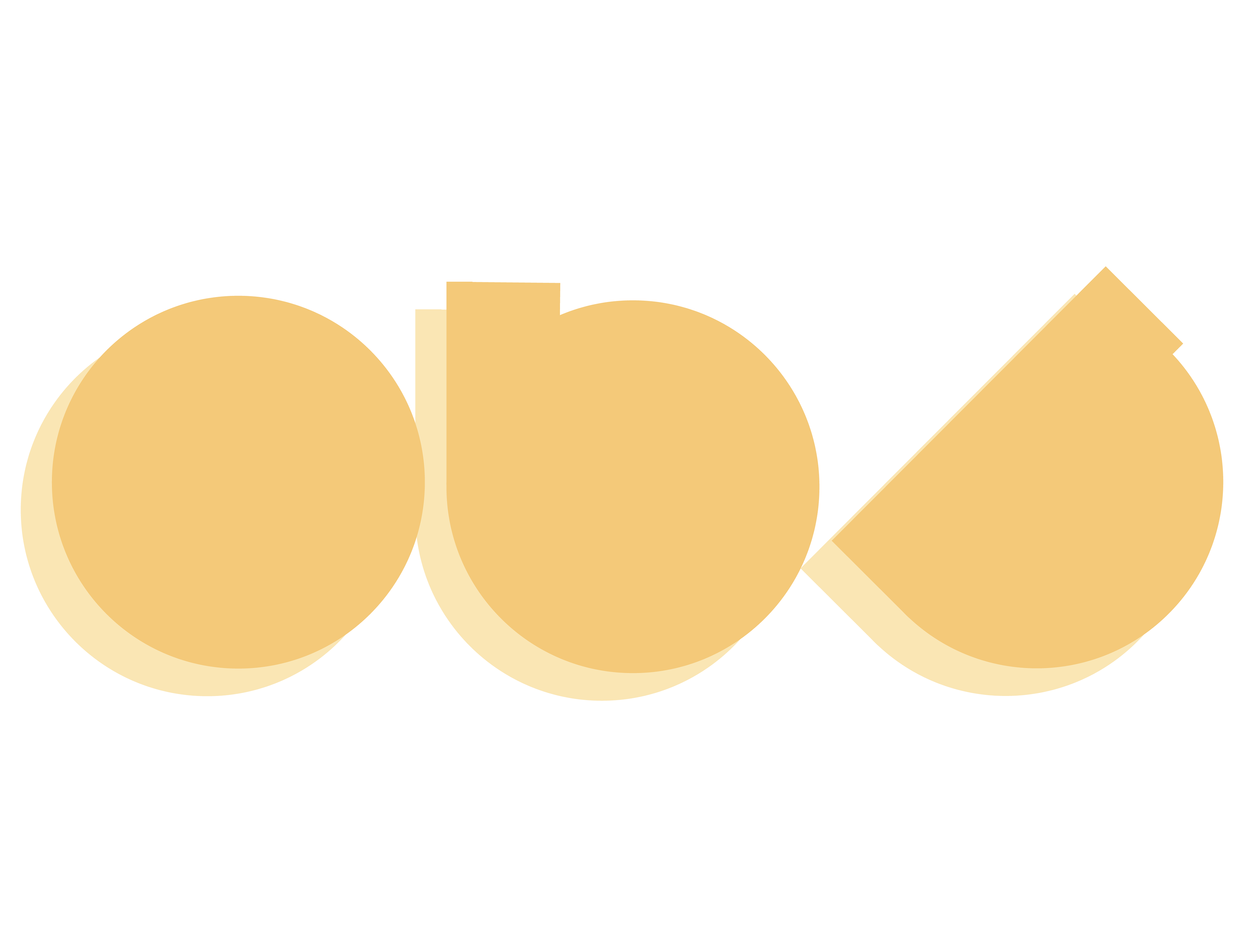
The challenge of this project was to capture the essence of camping and outdoor activity in a logo that best reflected the wants of the client to have stamp-like logos, that corresponded to each other, and were also original graphics. I believe the graphics compliment each other in associated style and colour, and overall achieve the intended aesthetic goals the client had set out.
Final Client Logo
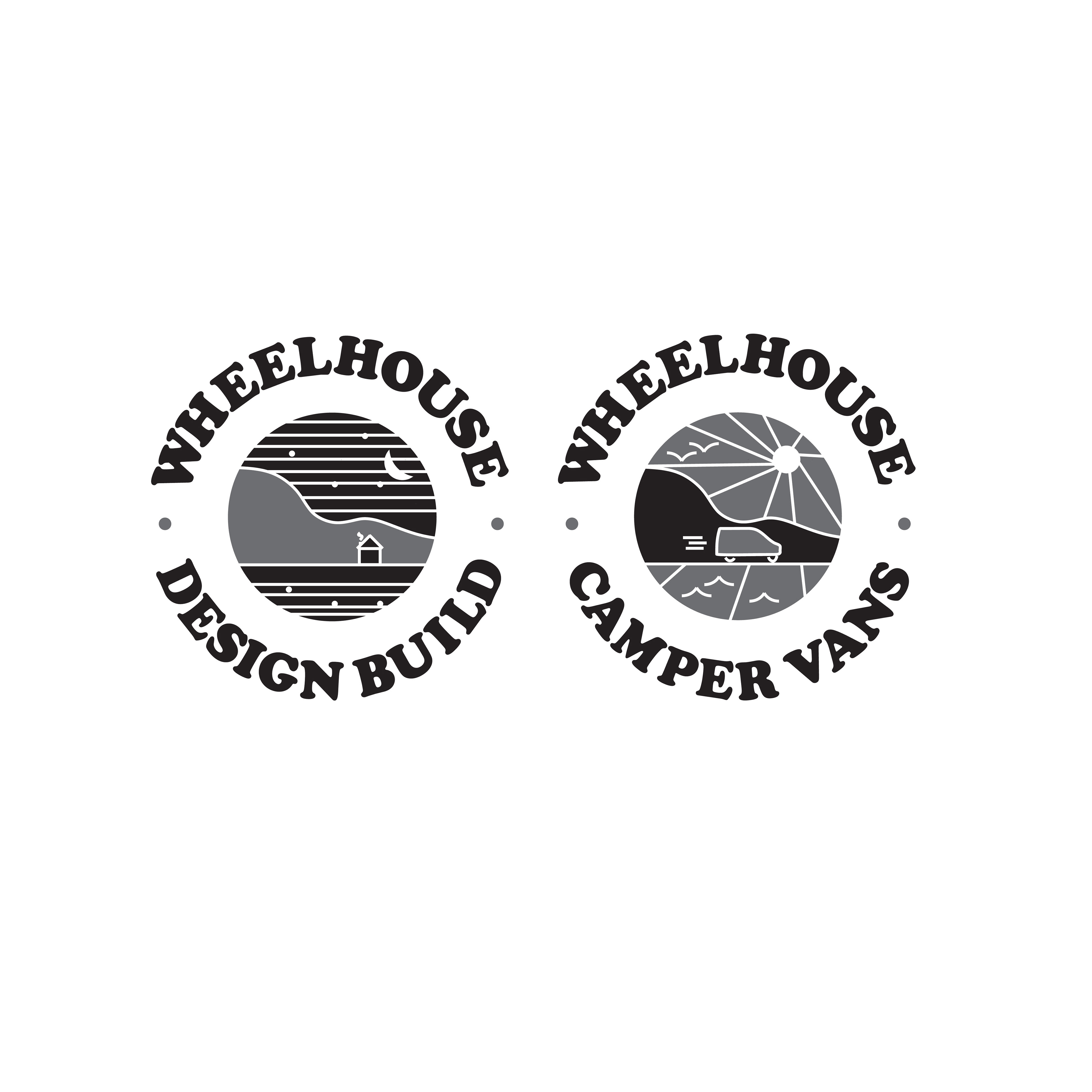
Final client logo B&W
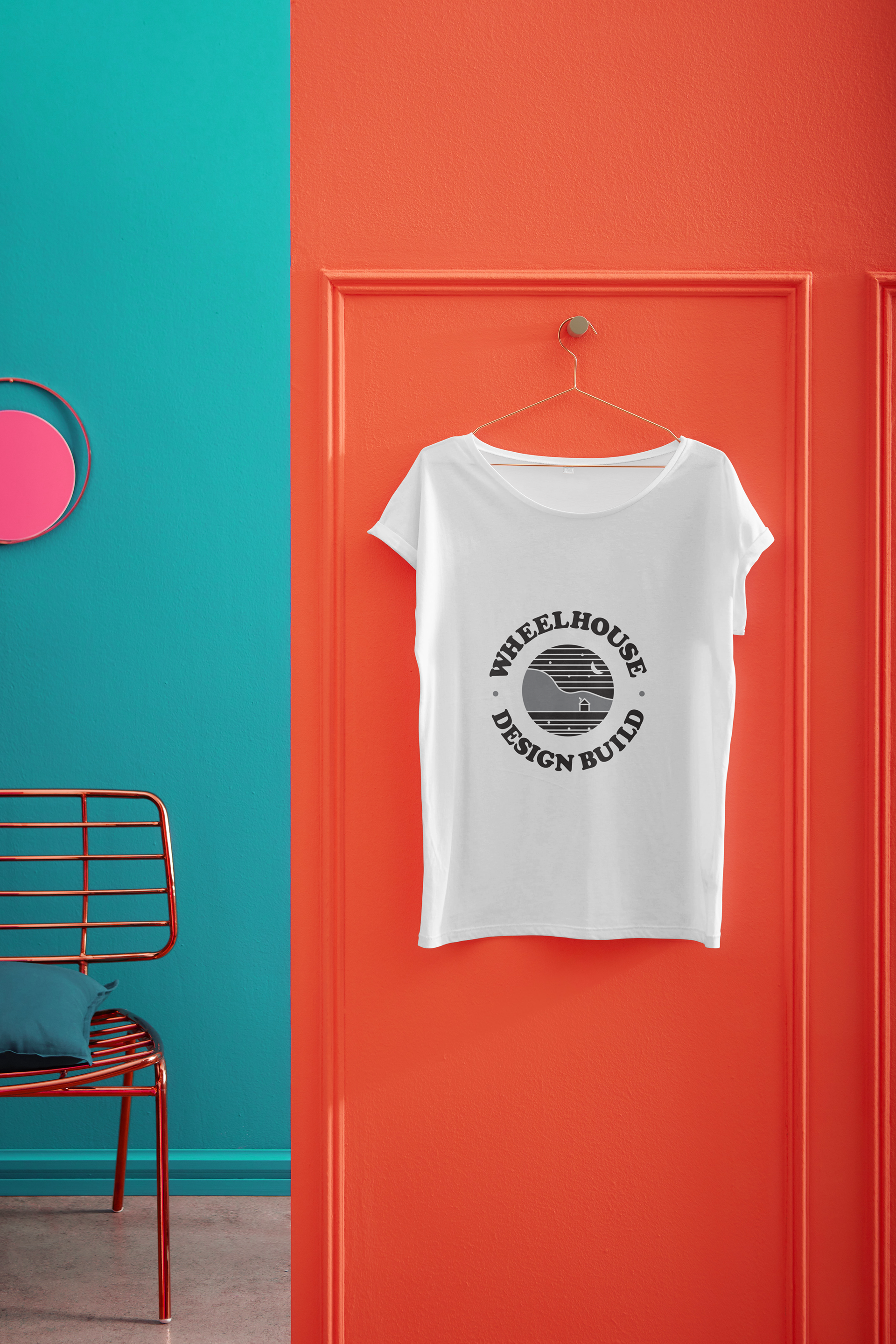
T shirt mockup of the Wheelhouse Design Build logo design
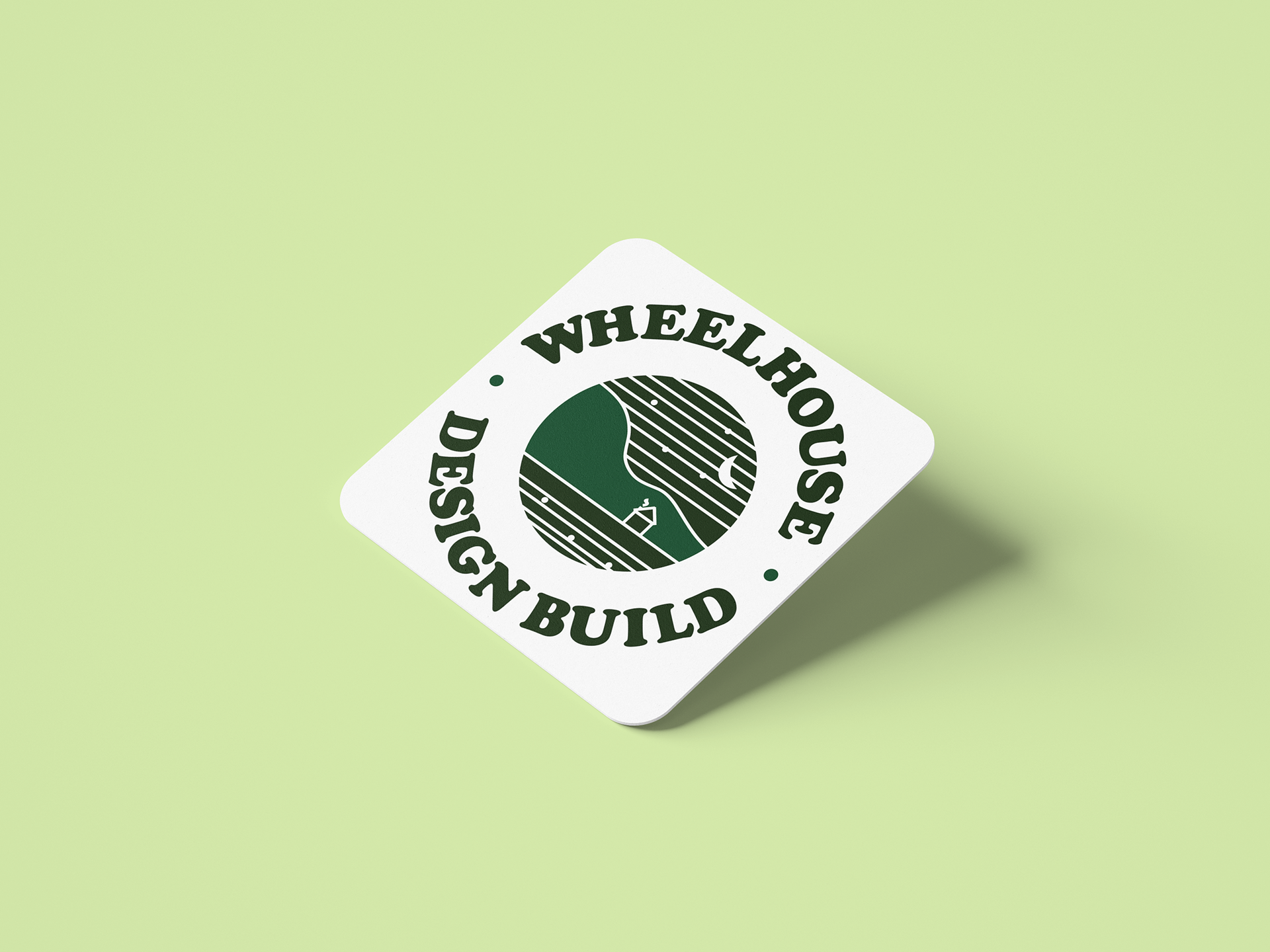
Coaster mockup with the Wheelhouse Design Build logo design